Imagine unlocking a 100% sales boost with just a sprinkle of strategic tweaks. Sounds magical, right? Well, it’s not sorcery – it’s the power of conversion optimization.
To help you tap into this incredible potential, we’ve assembled a brain trust of 40 conversion optimization gurus. They’ve generously shared their most potent tips for squeezing every drop of sales potential out of your pages.
Ready to supercharge your conversion rates and watch your revenue soar? Dive into this treasure trove of expert insights and prepare to be amazed!
What Is The Best Way To Improve Sales Page Conversions?
Andy Crestodina – Orbit Media
Every great sales page is a delightful dance between two crucial elements: satisfying visitor curiosity and earning their trust. Deliver answers to their burning questions right up front, then bolster them with irrefutable evidence. Skip the answers, and you leave them hungry for information. Skimp on proof, and your claims float away like empty promises.
Once you’ve gathered this potent content mix, prioritize it like a sales pro. Address key questions first, making sure relevant evidence stands close by like a supportive best friend. This structure keeps them engaged and builds trust step-by-step.
Seal the deal with a crystal-clear call to action, tailored to the specific desires that brought them to your page. When your call to action echoes that reason, conversion magic happens!
Dennis Yu
Forget silver bullets, these simple tweaks can supercharge your sales page conversions. We’ve seen these issues trip up even the best, yet fixing them is surprisingly low-effort, high-impact.
- Remarketing Powerhouse: You invested in getting visitors to your page, don’t let them disappear! Remarket to them on Google and Facebook. Shockingly, less than half do this on both platforms! And for an extra boost, use Google Tag Manager (it’s free!) to manage your pixels like a pro.
- Ditch the Static, Tell Stories: Tired of stock photos? Captivate your audience with video sales letters. They build trust and tell your brand story – no fancy equipment needed! Your customers want to hear from you, not models. Plus, 70% browse on phones, so 4K bells and whistles just slow them down.
- Speed Demon Sales Pages: Every second counts. Most sites lumber along at a painful 8-9 seconds to load. Test your speed with Google PageSpeed Insights and see what’s dragging things down. Then, unleash the lightning-fast power of Google AMP and Facebook Instant Articles (ask your landing page provider if they’re game!). Shave seconds off your load time and watch conversions soar.
Lilach Bullock
While the magic elixir for email conversions remains elusive, there’s one universal truth: value always wins. No matter your industry or audience, offering something of worth – resources, tips, exclusive offers – is the foundation for building a loyal subscriber base.
Personally, I champion the power of targeted content downloads. This simple tactic packs a punch: create blog posts packed with valuable information, then sprinkle in additional downloadable resources that enhance the experience.
It can be as simple as a “cheat sheet” summarizing your guide’s key points, or a bonus listicle brimming with relevant tools. Think of it as enriching your content, providing that extra nudge that incentivizes them to join your email family.
Marcus Miller – Bowler Hat
Forget magic bullets, conversion mastery takes strategic tinkering. While every product and audience dances to its own tune, Bowler Hat’s playbook offers five timeless tactics to ignite your sales page:
- Attract the Right Crowd: Traffic quality reigns supreme. Ditch those random banner ad drifters and lure targeted prospects who are primed to buy. Relevance is your secret weapon.
- Value Proposition Power: It all starts with understanding your customer. What are their struggles? What dreams do they chase? Craft a value proposition that solves their problems and fuels their ambitions. Show them how your offering is the missing piece to their puzzle.
- The Rekindled Spark: Don’t mourn lost visitors! Remarketing rekindles the flame. Keep your brand front-of-mind with targeted content and ads that reiterate your value proposition. You might just reawaken their purchase power.
- Baby Steps to Big Wins: Not every landing leads to a sale. But what if you could capture leads anyway? Offer micro-conversions like downloadable resources in exchange for an email address. It’s a foot in the door, and emails nurture future sales.
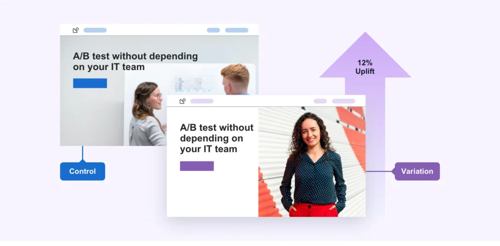
- A/B Testing: The Conversion Alchemist: Headlines, copy, CTAs, design – they all play a role. Experiment with different elements through A/B testing to see what resonates with your audience. A simple button color change can work wonders!
John Rampton – Calendar
Forget crafting the “perfect” page in a vacuum. Conversion magic starts with unflinching data: track everything. From clicks to scrolls, button colors to form friction, understanding what users do paints a clear picture of what needs fixing.
I’m an advocate for granular tracking. Button color? You bet I will test! Turns out, bright pink has been my champion conversion warrior. Shocking, right? But data doesn’t lie.
Once you’ve cracked the user behavior code, testing becomes your playground. Armed with insights, you can confidently experiment with elements, headlines, and flows to optimize for conversions. It’s like having a map to buried treasure!
Marie Haynes
The winds of search algorithms are blowing towards trust. Building user confidence in your sales pages isn’t just about feeling good, it’s about potential SEO gold. Google’s AI is getting smarter at sniffing out trustworthiness, and aligning your page with these signals can give you a hidden edge.
Here’s how:
Transparency Reigns Supreme: If you collect personal data, be crystal clear about your security practices. Show off encryption badges, explain privacy policies, and make opting-in a conscious choice. Transparency fosters trust.
Stand Out from the Crowd: In a sea of similar products, shout your unique value proposition. Are you an industry veteran? Do you boast stellar customer reviews? Showcase awards, certifications, and testimonials prominently. Convince users you’re the better choice.
Social Proof Power: Testimonials aren’t just feel-good fluff. They’re trust boosters. Feature glowing customer quotes, case studies, and social media mentions. Let others sing your praises and build social proof that resonates.
Dave Schneider – Less Churn
Forget wishful thinking, split testing is the rocket fuel of conversion optimization. But before you blast off, there’s a vital reality check: you need enough passengers (traffic) and fuel (conversions) to run a meaningful test. If not, bigger issues might be lurking in your marketing stratosphere.
Luckily, many page builders like LeadPages have built-in testing tools. Need something free? Google Optimize is your launchpad. Remember, big changes are the bold astronauts of your test – the more distinct the elements, the quicker you’ll see a result.
So, buckle up and prepare for a series of split testing missions. Test headlines, layouts, calls to action – the possibilities are endless! Soon, you’ll have a sales page that converts so well, it might just need its own airlock.
Dominic Wells – Human Proof Designs
Forget magic formulas – unlocking conversion magic comes through strategic experimentation. Every sales page dances to its own tune, so what elevates one might silence another. That’s why benchmarking is your first dance step. Measure your current conversion rate – it’s your baseline for testing success.
Now, grab your split-testing toolkit and get ready to experiment! Test individual elements – headlines, buttons, copy, you name it. But remember, slow and steady wins the race. Run each test long enough to gather reliable data, and don’t juggle too many variables at once. Keep your focus laser-sharp.
Don’t forget, conversions are a journey, not a destination. A change that boosts initial sign-ups might stall later in the funnel. That’s why analysing the bigger picture is crucial. Track how your tests impact every step of your customer journey, from initial click to final purchase.
Ian Brodie
Forget automation, ignite conversation: Live chat is your conversion secret weapon. While some marketers chase hands-off magic, savvy ones like you know the power of a personal touch. Enter the live chat widget: Drift, Intercom, or your favorite hero waiting on your sales page.
Here’s how it unlocks conversion gold:
- Proactive Q&A: New visitors often have unspoken questions, fears, and hesitations. Your sales page can’t read minds, but a strategically timed chat pop-up can. Just a tap on the shoulder (virtually speaking!) and a “Can I help?” goes a long way.
- Conversion Catalyst: Address those hidden doubts, provide reassurance, and bam! You’ve just crushed a conversion barrier. Live chat builds trust, clarifies your offering, and turns hesitant browsers into confident buyers.
- Feedback Treasure Chest: Every chat is a gold mine of insights. Common questions reveal gaps in your sales page. Use this feedback to fine-tune your copy, address concerns upfront, and create a page that speaks directly to future customers.
It’s not just about automation, it’s about building real connections and transforming conversions. So, go forth, chat it up, and watch your sales page flourish!
David Krauter – Websites That Sell
Believe it or not, we’ve seen massive conversion jumps by just fixing these core page issues for our clients:
- Snail-paced speed? Kiss it goodbye. Optimize your site for lightning-fast loading – every second counts.
- Cumbersome cart? Streamline the checkout process. Frictionless buying = happy customers.
- Missing direction? Guide visitors with clear calls to action. Tell them exactly what to do next.
- Mismatched audiences? Tailor your landing pages. Different traffic demands different experiences.
But before diving into advanced tactics, focus on these essentials:
Conversion Kitchen – Must-Have Ingredients:
- Small logo: Size doesn’t matter, focus on value.
- Phone number & CTA: Make it easy for them to reach you.
- Contact options galore: Forms, buttons, let them choose.
- Clear CTAs: Don’t leave them guessing, tell them what to do.
- Blazing speed: Patience is a luxury online, keep them engaged.
- Functional buttons: Every click should lead to conversion paradise.
Master these basics, and you’ll be amazed at the conversion surge. Remember, a solid foundation is key to building a conversion castle. So, prioritize the fundamentals, watch your sales soar, and then, if you crave it, add the fancy frosting later!
Converting those late-stage leads into loyal customers? We’ve got your back with e-commerce and lead-generation tactics that pack a punch:
E-commerce:
- Frictionless Flow: Autofill fields, mobile-friendly layouts, and obvious CTAs – make checkout a breeze. Remember, smooth sailing leads to happy sailors (and paying customers).
- Mobile First: Think big thumbs, not tiny mice. Large tap targets and top-of-fold essentials keep mobile shoppers on track.
- Content is King: High-def images, engaging videos, and honest reviews – give them something to feast their eyes on before making that final decision.
Lead Generation:
- Dialogue, Not Download: Forget forced forms. Start a conversation with a few key questions, personalize their experience, and nurture trust before asking for their precious info.
- Go Voice-Ready: Cater to the voice-activated future. Prompt triggers for Google Assistant and Alexa, letting users seamlessly move your brand onto their smart speakers.
- Competitive Intel: Learn from the best. Analyze top-ranking pages, track their changes, and see what sparks their lead-generating magic. Use JumpShot to discover their keyword goldmine and thread those gems into your own SEO strategy.
Testing is the Conversion Compass: Never stop tweaking! UserTesting, Mechanical Turk, and A/B testing are your allies in uncovering what truly resonates with your audience.
Allan Pollett
My SEO magic used to be all about traffic torrents. Rank at the top for hot real estate keywords? Check. Streams of visitors? Double check. Yet, leads? Tumbleweeds. Why? Trust was missing.
My generic lead-gen sites felt impersonal, robot-run. They lacked the human touch that builds trust. So, I pivoted. Instead of serving faceless entities, I partnered with a specific realtor, breathing life into the site.
His face, name, and address became the cornerstone. Suddenly, it wasn’t just a website, it was John’s real estate haven. The trust factor skyrocketed, and guess what? The leads flooded in.
People crave connection, a sense of dealing with a real person, not a faceless corporation. It’s a lesson etched in my conversion playbook: build trust, reap leads.
Want to unlock this superpower? Here’s your toolkit:
- Put a face (or faces!) to your brand. Photos, bios, stories – show your human side.
- Embrace video. Product demos, team intros, customer testimonials – let them see, hear, and connect. Remember, video converts 5 times better than plain text.
- Be transparent. Share your values, your process, your vulnerabilities. Authenticity fosters trust.
SEO still matters, but without trust, it’s just an empty traffic jam. So, weave trust into your digital fabric, and watch your conversion rate dance to a delightful new tune.
Jon Tromans
Every visitor arriving at your sales page carries a hidden banner: “I’m here for a reason!” Understanding that intent, their unspoken needs and desires, is the key to unlocking conversion magic.
Think of yourself, curtain pole bracket in hand. You don’t need Shakespearean sonnets on curtain history – you need instant answers: diameter, colour, “fix my window drama now!”
So, speak their language. Craft titles, headings, and content that echo their intent like a friendly echolocation guide. For your curtain crusader, that means clear specs, vibrant colour options, and a bold call to action that screams, “Hang those drapes with confidence!”
Remember, attention spans are shorter than TikTok dances. Guide them on their journey, not on a meandering museum tour.
And don’t forget the conversion cavalry: your calls to action. Offer options, cater to different styles. A big, bright button for the impulsive clicker, a subtle text link for the contemplative browser. Make it easy for them to say “yes”!
Your sales page is a conversation, not a monologue. Listen to their unspoken questions, answer them head-on, and pave the path to conversion. Do that, and watch your visitors transform from puzzled wanderers to satisfied customers, one click at a time.
David Leonhardt – SEO-Writer
Forget chasing leads, let them come to you! My secret weapon? A floating query form, a loyal companion that sits perched in the corner of your visitor’s screen, no matter where they scroll. Think of it as a friendly gremlin, always ready to whisk away their inquiries.
Before this floating wonder, queries were scarce. But the moment it popped up, boom! An instant surge in requests. Why? It’s all about accessibility:
- Impatient Clickers: See the form, click the button, bam! Quote request sent, mission accomplished. No scrolling, no fuss.
- Cautious Scrollers: They peruse your page, absorbing every detail. But the ever-present form reminds them, “Hey, I’m here if you need me!” No need to backtrack, just a quick click at the bottom.
- Word Enthusiasts: They devour every sentence, reaching the bottom with newfound insights. And guess what? The form is still there, ready to capture their query without an uphill climb.
The result? Conversions skyrocketed. No matter their browsing style, everyone has a one-click path to requesting a quote. It’s like having a 24/7 sales assistant, always a tap away.
Chris Makara
Think of your sales page as your conversion laboratory, where each tweak is an experiment waiting to unfold.
Sure, robust traffic is the fuel for meaningful tests, but don’t let that stop you from tinkering. Tools like free A/B testing platforms or Google Analytics event tracking are your trusty lab assistants, helping you monitor and measure every change.
Not every test will be a Nobel Prize winner, but that’s the beauty of iteration. Each experiment, even the “not-so-winners,” provides valuable data, inching you closer to conversion gold.
Imagine gradually bumping your conversion rate, bit by bit. Every tweak, every test, fuels the growth curve, eventually leading to a sales page that’s a conversion powerhouse.
Joel Klettke – Business Casual Copywriting
It’s less about flashy hacks and more about deep-dive research. Think of your underperforming sales page as a mystery, and you, the data Sherlock Holmes.
To crack the case, you need to ask the right questions:
- Is your promised land a paradise they crave? Or just another bland vacation brochure?
- Does your siren song captivate their ears? Or do they hit mute and scroll on by?
- Is your call to action a warm invitation? Or a pushy salesman at the airport gift shop?
- Do your visuals amplify your message? Or are they blurry vacation snapshots no one cares about?
- Are you even talking to the right adventurers? Maybe your treasure map leads to the wrong island!
To solve the conversion puzzle, gather intel from every corner:
- Watch their every click and scroll – like a fly on the wall, observe their page exploration.
- Map their digital footprints – see where they wander, where they linger, where they get lost.
- Tap into their hidden desires – listen to their own words in surveys, chats, reviews – their pain points, their dreams, their secret maps to conversion gold.
Jose Perez – Emet Digital
Stop playing conversion roulette with A/B tests based on guesswork. Hotjar and Inspectlet become your data detectives, revealing the hidden secrets of how visitors interact with your sales page.
Think of heatmaps and session recordings as X-ray glasses for your website. They show you:
- Click hotspots: Where fingers click, eyes linger, and conversions ignite.
- Hover havens: Areas that pique curiosity but lack action.
- Exit portals: Where attention drains and leads disappear.
Armed with this behavioral intel, your testing moves from blindfolded darts to laser-focused precision. No more tweaking the wrong elements or missing the real conversion culprits.
Here’s how the lack of these “X-ray glasses” can lead to conversion catastrophes:
- Above the fold fixation: Obsessing over the top when the real action happens below.
- Copy crusades in no-man’s-land: Rewriting text nobody reads while attention magnets go untouched.
- Click mirages: Users tapping invisible buttons, yearning for hidden tooltips and missing links.
- Distraction dance: Secondary elements stealing the spotlight from your star – the CTA.
- Mobile mayhem: CTAs vanishing, buttons shrinking, user journeys crashing on small screens.
Sure, some best practices are intuitive, but data is the ultimate truth serum. It exposes hidden flaws, validates gut feelings, and steers your optimization efforts towards a conversion bonanza.
Pierre de Braux – Spiralytics
While A/B testing CTAs and headlines is vital, the real conversion powerhouse lies in unlocking buyer confidence. Think of it this way: a shaky bridge might get a few intrepid souls across, but a sturdy one welcomes a stampede of happy customers.
So, how do you forge this trust bridge across the digital abyss? By weaving in trust signals like threads of gold:
- Accurate contact details: Show you’re reachable, not a phantom.
- Verified partners and security seals: Flaunt your trustworthy friends and shields.
- Payment badges: Let them know their precious digits are safe.
- Customer testimonials: Let real voices sing your praises.
- Active social media: Prove you’re not a social hermit.
- SSL certificates: Padlock their worries and unlock their wallets.
These trust signals are your secret handshake with potential buyers. They whisper, “We’re the real deal, and your purchase is in good hands.” With doubts dispelled and confidence soaring, conversions dance to a joyous tune.
Sonja Jobson –Fresh Coast Creative
Forget information overload, it’s simplicity that sells. Sales pages become conversion graveyards when choked with details. Instead, think laser focus. Here’s your framework to declutter and dominate:
Headline Hook:
- Bold and clear, not Shakespearean. Grab attention in a flash, not a sonnet. Your goal? Make them stay, not scroll away.
Problem Painter:
- Show the “before” picture. Don’t sugarcoat their struggle. Paint a vivid picture of the pain they face without your solution.
Solution Savior:
- Become their hero. Don’t just offer a product, offer escape. Show, in concrete terms, how you vanquish their woes.
Proof Positive:
- Facts, not fairy tales. Testimonials, case studies, reviews – real voices singing your praises. Build trust, not doubt.
Call to Action Cavalry:
- Bold buttons, clear commands. “Buy Now,” “Get Started,” not cryptic riddles. Make action effortless, not an Easter egg hunt.
Sotiris Sotiriadis – Realistic SEO
My team saw the goldmine – abundant organic traffic, ripe for conversion. Instead of SEO spelunking, we focused on building a conversion castle, a funnel to transform curious visitors into dedicated followers.
First, value reigns supreme. We crafted irresistible opt-in forms, like site-wide banners offering valuable freebies – mini-courses or juicy ebooks. These weren’t just trinkets; they were keys to unlocking dating wisdom. Making opt-ins effortless became our mantra – one click, and they were on their way to dating mastery.
The results? Conversions erupted like fireworks on launch day, a steady stream of eager subscribers flowing in. This tale whispers a powerful truth: when value meets accessibility, leads flock like lovebirds.
Dai Carillo – PureB2B
There’s a smarter solution: the hybrid hero. This sales page champion combines the best of both worlds, packing a punch above the fold and a persuasive punch below.
Think Muckrack.com: boom! Instant product grasp, two CTAs like tempting appetizers, one for the impulsive “Start Now” crowd, the other for the “Try Before You Buy” crew. Scroll down, and you’re greeted by social proof sizzle and a deeper dive into the product’s magic.
The genius? You hook ’em fast with clarity and options, then reel ’em in with details and persuasion. It’s like a one-two punch for conversions, satisfying both quick clicks and informed decisions.
Here’s why it works:
- Above the fold focus: No need to hunt for the value proposition. It’s front and center, grabbing attention with laser precision.
- Dual CTA delight: Cater to different buying styles. Impatient clickers? They’re covered. Cautious researchers? You’ve got them too.
- Progressive persuasion: Start with a quick overview, then dive into the juicy details, building trust and desire step by step.
Scott Fish – 32 Digital
Forget sales pitches and gimmicks – trust is the true conversion king on your sales page. Whether you’re a service hero or a product paladin, building that bridge of trust is key to unlocking happy customers and overflowing coffers. Fear not, brave marketer! Here are three secret weapons to slay conversion woes:
- Let your champions sing your praises:
Testimonials and reviews aren’t just bragging rights; they’re trust cannons. Third-party voices like quotes and success stories add an air of authenticity, making visitors feel like they’re joining a happy tribe, not venturing into the unknown. So, showcase those customer experiences prominently! Every glowing review is a beacon drawing new recruits to your conversion castle.
- Reveal the hidden treasure within:
Selling is an art, not a war. Don’t bludgeon with features, illuminate with value! Show, don’t tell. Weave stories, paint pictures, and highlight the hidden gems that make your product or service sign. Let visitors discover the potential, the “aha!” moment, that transforms their lives. When they see not just a product, but a key to their desires, conversions erupt like fireworks.
- Forge the personal connection:
Your brand isn’t just a logo, it’s a friend. Connect with your visitors on a human level. Share your story, your values, your mission. Show them the faces behind the brand, the passion that fuels your creation. When visitors feel a personal resonance, a shared “this is me” moment, the conversion walls crumble. They become champions, not just customers, spreading the word and bolstering your sales page fortress.
Tim Brown – Hook Agency
Your ideal customer has trust triggers, hidden desires waiting to be ignited. My secret weapon? Placing visual beacons of those triggers around your call to action button!
Think glowing badges of featured publications, testimonial portraits with five-star smiles, or lightning bolts for “fast and free shipping.” Whatever gets your customer’s heart racing, show it, don’t tell it. Let these trust icons be the confetti on your conversion parade, sprinkled right next to the “Add to Cart” button.
Friction is the enemy of purchases. In one A/B test, I boosted sales by $10k just by adding little “Made in the U.S.A.” flags and shipping icons near the button. It’s not magic, it’s understanding your customer’s anxieties and whispering “Don’t worry, we’ve got you covered.”
Here’s the key:
- Talk to the frontline: Sales staff and customer champions hold the treasure map to your customer’s desires. Listen to their stories, their worries, their “ah-ha!” moments.
- Visualize the trust triggers: Don’t just boast, show! Images, icons, badges – make those trust factors shine like neon signs, guiding your customers towards the purchase.
- Friction-free conversions: Every click, every doubt, slows the buying journey. Remove roadblocks with visual reassurances, like trust icons whispering, “It’s easy, it’s safe, it’s for you.”
Steve Kurniawan – Nine Peaks Media
The real conversion hero isn’t your fancy widget, it’s your value proposition – the transformative magic your brand offers. People don’t buy features, they buy benefits, dreams fulfilled, problems vanquished. So, how do you craft a value proposition that sets your sales page ablaze?
- Hone your value gem: Make it clear, concise, and captivating. No vague promises, just laser-focused benefits that sing to your ideal customer’s soul. Be honest, be genuine, your value proposition is your brand’s north star, guiding every aspect of your page.
- Stand out from the crowd: Show what makes you the quirky unicorn, not the boring draft horse. Highlight your unique strengths, the secret sauce that sets you apart from the competition. Be the oasis in the conversion desert, offering something refreshing and unforgettable.
- Sing your value symphony: Let every element of your page be an instrument in the orchestra of your value proposition. Design, copy, visuals – all should harmonize in a unified chorus, constantly reminding visitors of the transformation you offer.
Viktoriia Pavlova – Starlight
Forget one-size-fits-all tricks, it’s time to listen to your website whispers. Understanding your audience is the real conversion magic, and these techniques are your secret tools:
- User Testing:
Gather real people, your ideal customer squad, and turn them into your website testers. Watch them click, scroll, and speak their minds. Observe their confusion, their delight, their “aha!” moments. Thirty testers, your minimum crew, to unveil what works and what needs a rewrite. Your design, your copy, all informed by their invaluable verdict.
- Heatmap Hero:
This visual maestro paints a picture of where fingers dance and eyes linger. Heatmaps reveal scroll depths, button hot spots, and attention deserts. No more guessing where to place your conversion crown jewels – the “buy” buttons, the links, the forms – let the data guide you to conversion glory.
- Readability Test:
Your sales copy, the words that whisper to wallets, can make or break the deal. Simple words, short sentences, the clarity cavalry to the rescue! Let your target audience be the judge. Can they grasp your message in a flash? If they understand, you’re ahead of the pack. But if their brows furrow, investigate the confusing culprits – those jargon monsters and sentence marathons.
- The Ultimate Test:
Once clarity reigns, ask the ultimate question: does your copy sing, does it spark desire, does it make them click “buy”? If not, delve deeper. What words turned them off? What sentences felt flat? Use their feedback to polish your pitch, to craft a message that resonates, that compels them to join your customer kingdom.
These techniques are your compass, guiding you towards a sales page that truly speaks to your audience, a page that converts curiosity into customers, clicks into cash.
Olesia Korobka – Fajela
In today’s mobile-first world, optimizing for thumbs, not just desktops, is the key to conversion kingdom. Ditch the dreaded “shrink it and forget it” approach, where pages simply shrink under mobile pressure. Instead, embrace mobile-first design, crafting an experience that sings on smartphones from the get-go.
Think “hot leads, instant gratification.” When mobile users land on your page, they should feel the sizzle of relevance instantly. No confusing layouts, no microscopic text. Clear headlines, font sizes fit for thumbs, and images that enhance, not distract. Use visual cues – arrows, subtle effects – to guide their fingers towards the checkout button or inquiry form.
Some visitors need a gentle nudge, not a push. Offer them bite-sized informational treats – customer testimonials, explainer videos, blog posts – showcasing how your product solves their problems. These are like appetizers, whetting their appetite for the main course: the purchase.
And for those still warming up to the idea? Deploy your lead magnet charm. Offer a freebie – an add-on, checklist, e-book – in exchange for their email address. This opens the door for gentle follow-up emails, gently reminding them of your awesomeness and nudging them closer to that “buy” button.
Here’s the mobile conversion mantra:
- Design for thumbs first. Prioritize clarity and ease of use on small screens.
- Instant gratification: Make the value proposition and call to action crystal clear.
- Informational appetizers: Offer bite-sized content to educate and nurture leads.
- Lead magnets: Tempt hesitant visitors with valuable freebies in exchange for contact details.
Melody Spencer – Swiftly Social Digital Marketi
Your audience, especially on mobile, has the attention span of a hummingbird on espresso. So, keep it short, sharp, and sweet. Leave the epic novels for fantasy shelves, your sales page needs laser focus.
Forget the fancy bells and whistles – simplicity reigns supreme. Often, the ugliest, most bare-bones pages convert like champions. Why? Because they cut through the fluff and deliver the goods – your value proposition – in a crystal-clear, bite-sized punch.
But don’t mistake brevity for emptiness. Infuse every element with cohesive messaging and imagery. Think of your entire marketing funnel as a journey, where each piece – social media, emails, landing pages – sings the same captivating tune. This builds know-like-and-trust, the holy grail of conversions. Visitors feel welcomed, understood, and ready to join your conversion kingdom.
Sameer Somal – Blue Ocean Global Tech
Forget the sales page vs. landing page feud – both can be conversion champions! While sales pages focus on the “buy now” button, landing pages offer diverse goals, like newsletter signups or webinar registrations. But the conversion secrets they hold? Shared superpowers!
1. Trust your way to the top: Become the industry Gandalf, wielding the staff of high-quality content. Informative blog posts, insightful videos, free downloadable guides – these are your trust-building spells, casting doubt aside and inviting visitors to see you as the expert they can rely on.
2. Headline with hypnotic power: Craft a headline that’s irresistible, a siren song luring clicks. Remember, it’s the most-read element, your first impression. Think intriguing, specific, and benefit-driven. Tease the solution, spark curiosity, and watch them scroll down wanting more.
3. Call to action, the conversion charm: Your CTA button? It’s not just a button, it’s a portal to conversion paradise. Make it clear, concise, and action-oriented. Mirror your headline’s promise; if your headline sings “Custom Logo for $50,” let your CTA roar “Create Your Logo Now!” Don’t be afraid to experiment with different CTAs – A/B testing is your friend. But remember, moderation is key, too many choices can lead to conversion confusion.
4. Live chat – the conversion whisperer: Don’t let missed connections turn into lost conversions! Embrace live chat, be the friendly face ready to answer questions and guide hesitant visitors towards that “buy” button. A responsive, helpful presence can turn a browsing skeptic into a loyal customer.
Natalie Athanasiadis – Ormi Media
Ditch the conversion guesswork, chart your action map!** Before you build your sales page palace, lay the conversion brickwork first. Ask yourself, “What’s the one action I want visitors to take here?” A newsletter signup? A checkout click? Define your conversion holy grail, and watch every element sing its praises.
Think of your page as a compelling call to action symphony. Every image, every video, every word – all orchestrated to lead your visitors towards that conversion crescendo. Eliminate distractions, those siren songs that lure clicks away. Keep your focus laser-sharp, like a sniper targeting the buy button.
Resist the urge to info-dump! Business owners often think a product encyclopedia equals conversions. But remember, less is often more. Don’t drown visitors in a sea of details – prioritize clarity and focus. Offer just enough to spark interest, enough to whisper the promise of your solution.
Craig De Borba – OnPoint Internet Marketing
In the arena of sales pages, the king is an irresistible proposition, an offer so juicy, so mouthwatering, that visitors would be fools to walk away. This, my friend, is the secret weapon that ignites conversion flames.
So, crank up the offer intensity! Ask yourself, what’s the boldest, most outrageous value bomb you can drop? Make it so good, so transformative, that missing it would leave a gaping hole of regret in their hearts.
Then, let your copy be the validation brigade, armed with testimonials, case studies, and badges of authority. Show them, don’t just tell them, how your offer is the bridge to their desired land, the problem-solved paradise.
Speak benefits-first, solutions-foremost. Use bullet points, lists, and bold keywords to guide their scanning eyes towards the oasis of transformation.
But don’t forget, imagery speaks volumes. Use visuals that resonate with your audience’s soul. No generic models, no stock photos – mirror their reality, their aspirations. Let them see themselves reflected in the success your offer promises.
The call to action, the conversion crown jewel. Make it dazzle in a color palette of its own, a beacon in the design landscape. Draw their eyes, beckon their fingers, make that button the irresistible portal to their new and improved selves.
This, my friend, is the recipe for a sales page that converts like a champion. An offer so potent, a message so clear, and visuals so resonant, all crowned with a call to action that sings.
Leonard Ford – Design Fire
When it comes to product pages, trust is the conversion currency, and surprise shipping costs can drain that trust faster than a leaky bucket. So, why not make your prices sing the full song, with shipping included?
Think about it: a consumer sees your product, weighs its value against the advertised price, and decides it’s worth it. They’re on a buying spree, finger hovering over the “add to cart” button. Then, bam! Shipping costs hit them like a ton of bricks, shattering their budget and rekindling the dreaded cost-value debate. Cart abandonment rises, trust plummets, and you’re left picking up the conversion crumbs.
Enter the magic of “free” shipping (well, actually included shipping). That $25 product + $5 shipping? Transform it into a glorious $30 with “free” shipping! It’s a subtle shift, but the psychological impact is conversion gold. They see the final price, they trust it, they breeze through checkout, and boom! A completed purchase, a happy customer, and a foundation for future loyalty.
Building trust through price transparency and “free” shipping (aka included shipping) is an investment that pays off, not just in immediate conversions, but in repeat customers who sing your praises and keep your sales engine humming.
Jason Scott – SessionCam
In today’s web-whizzing world, attention spans are shorter than hummingbird naps. So, serve up the juiciest content first, the bits that answer visitors’ unspoken “what’s in it for me?” cry. This means placing your conversion crown jewels – offers, CTAs, value propositions – front and centre, right at the top of the page. Treat it like a VIP lounge for attention.
Tailoring is key. Consider your target audience – they’re not a homogenous blob! Men, the visual explorers, might be enticed by bold visuals and action-packed videos. Women, the information seekers, crave compelling copy and detailed stats. If you’re targeting both? Don’t worry, you can be the buffet of brilliance! Offer a diverse spread of content, a smorgasbord of text and visuals that caters to every preference.
And don’t underestimate the power of visual storytelling. Ditch the stock photo snoozefest and invest in high-quality visuals. Think large, bright, and oh-so-real. Let your images and videos complement your copy, not compete with it.
Gábor Imre – ROI Foundry
A perfect page needs more than just bricks and mortar – it thrives on structure, consistency, and harmony. Think of it as a symphony, where every element, from design to copy, sings in perfect unison with the brand’s core melody.
The sales copy? The lead vocalist! Sure, incentives and features play their part, but benefits are the power ballad that truly rocks the audience. Speak to their pain points, their deepest needs, and weave a story that resonates on an emotional level.
A great sales page isn’t a one-act show. It’s a multi-part drama, guiding visitors through a transformative journey.
First, acknowledge their struggle, the knotty problem they face.
Then, unveil the promised land, the blissful “happily ever after” your offering delivers.
Next, introduce the hero – your product! Showcase its features, yes, but don’t forget the benefits, the superpowers that vanquish their foes. If needed, offer a step-by-step guide to problem-solving, a roadmap to their new reality.
Chris Hornak – Blog Hands
Building a champion sales page is a symphony of research, data, and intuition. It starts with deep understanding – yours and your brand’s DNA, goals, and target audience. Research your competitors, analyze their victories and stumbles, gleaning insights before launching your own campaign.
Now, assemble your dream team! Partner with seasoned web developers, tapping their best-practice expertise. But don’t underestimate your own gut feeling – intuition is powerful, let it guide the design dance alongside their technical prowess. Together, you’ll orchestrate a page poised for conversion greatness.
But the show doesn’t end at launch! Data is your backstage guide, whispering insights you need to hear. Track not just conversions, but every flicker of visitor behavior. Use tools like value-based tracking to see your page through their eyes – is a blog post worth $1, a sales page $50? By understanding the value you deliver, you can fine-tune your content and make data-driven decisions that turn clicks into conversions.
Eman Zabi – The Scribesmith
A killer sales page needs the soul of a wordsmith, and I’m here to show you why.
My secret weapon? Eavesdropping on your target audience. What keeps them up at night? What are their deepest desires, their most annoying pain points? I tap into real voices, real struggles, then weave them into your copy like threads of gold. The result? Benefits that sing, solutions that resonate.
But benefits alone don’t close the deal. I magnify those pain points, turn them into flashing neon signs demanding attention. Then, like a superhero swooping in, I unveil your product – the ultimate cure, the problem-slaying champion!
But wait, there’s more! I paint a vivid picture of the “after,” the life transformed by your product. Think sunrises after sleepless nights, laughter replacing worry lines. Your prospects feel the difference, see themselves basking in your solution’s glow.
Ed Fry – Hull.io
In today’s data-driven world, emails, ads, and even chatbots are dancing to the tune of real-time personalization, while many websites remain frozen in generic land. This disconnect spells disaster for conversions – why offer a one-size-fits-none experience when data can tailor it to perfection?
Think of it this way: a generic webpage is like a robot on autopilot, spouting the same spiel to everyone. But a data-powered page is a chameleon, adapting its colors and features to each visitor. Imagine swapping in their company logo, swapping out generic testimonials for industry-specific ones featuring their competitors, even tweaking the copy to resonate with their unique challenges. It’s like bringing the magic of a stellar sales rep online, crafting a bespoke experience that feels more like a conversation than a broadcast.
Data is the fuel for this personalization engine. Syncing valuable insights about each visitor – their interests, browsing behavior, even past interactions – you can transform your page into a dynamic, responsive landscape. No more one-size-fits-none frustration, just targeted content that speaks directly to their needs and desires.
Dmitriy – MiroMind
When your business thrives on custom solutions, from software development to design magic, your sales funnel starts before the “buy” button is even in sight. Every interaction, from the first “hello” to the final handshake, is a conversion opportunity waiting to be seized.
But how do you transform your service page into a lead-generating magnet? Fear not, fellow service providers, for 7 golden standards of CRO await:
- Design that Beckons: Think of your page as your digital storefront. Make it visually appealing and intuitive, a space that reflects your brand and resonates with your target market. Don’t get lost in design bells and whistles, though – clarity is king. Guide visitors effortlessly with a well-structured layout that leads them on a path to conversion.
- The Pain-to-Solution Symphony: Start by painting a vivid picture of your ideal client’s struggles. What are their pain points, their deepest frustrations? Then, like a conductor raising the baton, introduce your services as the solution-filled crescendo. Highlight the benefits you deliver, the unique value you bring. Don’t forget to bragg a little, showcase your experience, your stellar team, your impressive case studies. Build trust, establish credibility, and make them yearn for your expertise.
- Know Your Persona, Speak Their Language: Your service page isn’t a one-size-fits-all monologue. It’s a tailored conversation with your buyer persona. Are you wooing decision-makers with ROI promises and increased productivity? Or tech-savvy specialists eager for detailed specs and technical wizardry? Craft content that speaks directly to their needs and desires, addressing their specific concerns and showcasing the solutions that resonate most deeply.
- Content that Informs and Inspires: Your service page is your chance to make a lasting first impression. Treat it as such! Craft informative, well-structured content that explains your offerings, guides visitors through the next steps, and clearly articulates the value of choosing you. Remember, a concise and scannable format is key – let them grasp the essence of your services in a heartbeat.
- The “Sticky Note” CTA Trick: We’ve discovered a hidden gem in the optimization landscape: a strategically placed contact form on the right side of your page. It won’t replace your primary CTAs, but it can act as a subtle “sticky note” reminder, capturing leads who might hesitate to click a button.
- CTAs that Sing, Not Shout: Don’t bombard your visitors with a chorus of “Contact Us” buttons. Be strategic, be creative! Integrate engaging CTAs that flow seamlessly with your content, offering enticing alternatives like “Let’s Chat” or “Get a Free Quote.”
- Proof is in the Pudding (or Portfolio): Show, don’t just tell! Visual proof like client testimonials, case studies, and stunning before-and-after examples speak volumes. Let your past successes act as powerful sales tools, convincing leads that you’re the answer to their prayers.
Harris Brown – HFB Advertising
When it comes to optimizing your sales page, forget alchemy – data is your magic potion. And the most potent spell in your book? A/B testing! It’s like conducting scientific experiments on your page, tweaking elements from headlines that hook to fonts that enchant.
But before you whip out your lab coat, remember this: the “above the fold” real estate is prime gold. Headlines and subheadings are your attention-grabbing sirens, luring visitors in with promises of problem-solved paradises.
From there, it’s a carefully orchestrated dance of compelling copy, captivating visuals, and strategic design. Think colors that sing, layouts that flow, and fonts that mesmerize. Each element, from body copy that intrigues to calls to action that beckon, plays a crucial role in capturing leads.
But here’s the secret sauce: don’t spill the beans all at once! Keep your body copy enticing, leaving them yearning for more. And remember, there’s no silver bullet in optimization. Sure, bold text and reverse knockouts can add punch, but it’s about finding the harmonious blend that resonates with your audience.
Now, for a sprinkle of conversion magic: scarcity, the ultimate human-brain hack! Limited-time offers and “while supplies last” whispers trigger that primal fear of missing out, propelling visitors towards your call to action like moths to a flame.
Craig Smith – Trinity Insight
While online shopping booms, so does a familiar foe – purchase anxiety. Customers, just like captains navigating uncharted waters, crave the reassurance of smooth returns and easy cancellations. And who better to calm their seas than major retailers like Amazon, with their flagship return policies?
This is where savvy businesses, from retailers to SaaS companies, can unlock a conversion treasure chest. By clearly displaying cancellation and return policies, you become the lighthouse in their storm, eliminating risk and steering them towards that “buy” button. Think travel websites with generous cancellation windows, taking the stress out of planning and turning hesitant browsers into instant bookers.
But the benefits go beyond happy customers. Reduced risk equates to reduced marketing costs! No more chasing down abandoned carts or retargeting unconvinced audiences. Your marketing dollars work smarter, freed from the burden of constant persuasion.
So, audit your sales pages with a risk-reduction lens. Can you offer a free trial, showcase your return policy, or tempt them with a flexible month-to-month contract? Every barrier lowered, every fear quelled, is a potential conversion waiting to be unleashed.
Andy Drinkwater – iQSEO
The finish line is in sight – your visitors on your sales page, poised to convert. But then, mobile madness strikes! The information jungle is dense, the cart’s gone missing, and frustration boils over. Boom, another abandoned checkout.
Fear not, brave entrepreneur! Let’s transform your mobile page into a conversion champion with these 3 ninja moves:
- Carts cling like a koala: Forget hide-and-seek! Sticky shopping carts, nestled snugly in the footer, stay visible no matter where your customer roams. One tap is all it takes to peek at their treasures, keeping them engaged and purchase-focused.
- One-screen checkout nirvana: Scrolling fatigue is the enemy. Aim for a crystal-clear purchase summary on a single page. Let them see their goodies, review costs, and finalise their order – all with just a thumb’s scroll. Less scrolling, more buying smiles!
- Shipping secrets revealed: Don’t send them on a scavenger hunt for delivery details! Whisper those sweet shipping times and costs right there on the page. Transparency builds trust, and knowing exactly when their goodies will arrive keeps excitement simmering.
Final Thoughts
Driving traffic is not enough; conversion is the goal. Hopefully, this guide has provided you with useful information that you can use to improve your website’s conversion rate. Conversion rate optimization is a continuous process, and there is always room for improvement. So keep testing and tweaking your website to see what works best for you and your Sales pages.

Author: Christopher Smith
SEO and linkbuilding expert. More than 7 years of work in the field of website search engine optimization, specialist in backlink promotion. Head of linkbuilding products at GREAT Guest Posts, a global linkbuilding platform. He regularly participates in SEO conferences and also hosts webinars dedicated to website optimization, working with various marketing tools, strategies and trends of backlink promotion.